I know, I know. Everyone has already chimed in on this. But, quite honestly, I’m surprised how many design and user experience practitioners have added thoughts on this unfortunate mishap.
I think they have a point, though, when it comes to the design of that card that Steve Harvey was holding. It was definitely poorly designed. It’s as though someone printed it at the last minute. And, printed it straight out of an old database program.
I performed a brief UX audit of this artifact:
- First, why are there sticker labels on this card? That could have been human error right there. The names are printed in small font on tiny address label stickers.
- Why have stickers at all in this day and age, like it’s 1990 and we can’t just design and print on a decent laser printer, without a professional printshop or mail merge program that spits out labels?
- I’m sure those stickers had to be locked up till the reveal. Why not just design a decent card, print it, and keep the entire thing locked up till the reveal? At least that way, with placeholder text in a prototype of the card, you could have someone test the card for clarity and usability prior to the reveal. And, they could make a bigger deal out of it being locked up, like they do other award announcements with the “secret envelope”.
- It’s a silly card, with one user. But that user is playing a vital role in information delivery— and I’m sure getting it right means to the world to the contestants and their supporters.
I dug around a bit…
I like a lot of the points that Josiah Tullis had in his review of this card design. Josiah quotes some useful usability research from the works of Nielsen Norman Group, including banner-blindness, establishing the area in larger font in the bottom right as something that’s easily ignored by the mind thanks to our mental ad-blocking conditioning.
After watching the awkward event on YouTube, I have empathy both for Mr. Harvey, and the contestants. For the purpose of connecting this fiasco to user experience and design, consider those two of our personas.
- As Steve Harvey, I need a card that I can read clearly and easily without fail, so that I can deliver accurate information to the contestants and the crowd.
- As one of the beautiful Miss Universe contestants, I need to clearly hear the winning name (in case it is mine) so that I am prompted to take my first walk as Miss Universe 2015.
The second persona’s need is dependent on the first persona’s need. If the first guy can’t carry out his task successfully, the next persona won’t be prompted correctly. Or, will be prompted erroneously, as happened in this case.
Easy peasy, right?
Unless someone with no sense of empathy for either of those personas is designing the card. For both of those users, the stakes of accidental humiliation are high. Everyone is watching. This is not just a national pageant. It’s the Universe! Based on limited research (watching YouTube), the context may include a lot of anxiety, stress, pressure, timing, stance, posture, perfection… the list can go on. If I’m a designer of this card, I should not take that lightly. I’m going to aim for a user-centered, fail-safe design, to the best of my ability. I can make some assumptions of what would be smart in a design. I could also ask someone, the users or someone who represents the users, what it is they need in the design.
I’ve looked around to see how some designers approached this. Take a look:
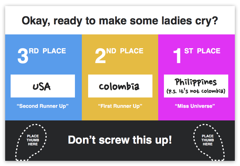
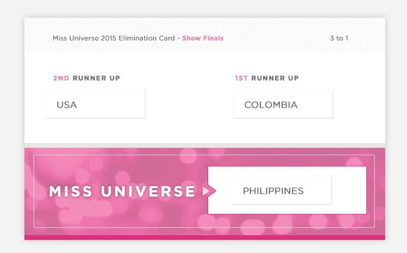
With that last design, which is probably the one I would choose, personally, I’d still say let’s drop the label stickers. The stickers look unnecessarily unpolished and unprofessional, in my opinion./figcaption>
Overall, I’m please at the reaction of the design and UX communities. These are not just people looking for a reason to bash a card design. Design and usability are everywhere. We don’t even have to look too hard to see these; we are surrounded by things and experiences every day that involve design and usability. Therefore, leaving the design of things in the hands of people who are without empathy is a huge mistake.
With that, I’ll close with this quote:
The least movement is of importance to all nature.
The entire ocean is affected by a pebble.
– Blaise Pascal